Show, don’t tell
Alberto Cairo, Power BI
& the rise of data journalism
Alberto Cairo, Power BI
& the rise of data journalism
From the election of Pope Francis to the passing of Nelson Mandela to Miley Cyrus’ MTV #twerk heard ’round the world, 2013 was full of big headlines and viral hits. Yet The New York Times’ top story of the year was the humble result of a vocabulary survey of 350,000 randomly selected Americans conducted by a then-intern at the paper.
The writer did the quiz three times: Twice it correctly picked Seattle and once it selected Yonkers, NY – 30 miles from where his mother grew up.
Instead of presenting these findings in a written article, “How Y’all, Youse and You Guys Talk” achieved breakout success as an interactive data visualization. It asked readers 25 questions such as “How would you address a group of two or more people?” or “How do you pronounce ‘aunt’?” and then heat-mapped their responses to the most similar regional dialect in the U.S. The interactivity and colorful visuals transmuted survey data into a fun, insightful tour through the contours of contemporary American English.
Visualization no longer just complements a written story. It is the story. In our increasingly data-driven world, visualization is becoming an essential tool for journalists from national papers to blogs with a staff of one.
I recently spent two days discussing the state of data journalism with Alberto Cairo, the Knight Chair of Visual Journalism at the School of Communication at the University of Miami. While he stressed the importance of data visualization for efficient communication and audience engagement, Cairo argued that “Above all else, visualizations — when done right — are a vehicle of clarification and truth.”
Visual journalism, in the broadest sense, has been around for a long time: first as maps, then as drawings and data-based charts that supplemented written copy.
By William Mitchell Gillespie
The New York Times, 1860
Gillespie, an important but virtually unknown dataviz pioneer, created this line chart of the U.S. census showing how the rank of populations of the states and territories changed from 1790 through 1850. It is an early example of a “slopegraph,” encoding 181 variables across 60 years. (Source: Scott Klein, Above the Chart)
The New York Herald, 1883
This is one of the oldest examples of a pie chart used in a newspaper. It compares the population of immigrants to native-born Americans. Pie, line, bar and circle charts were invented around the turn of the 19th century by Scottish political economist William Playfair. His work was ignored for decades after his death, which explains why this early journalistic example came 60 years later. (Source: Scott Klein, Above the Chart)
By Bernard Porter, 1939
This map of physics describes itself as “containing a brief historical outline of the subject as will be of interest to physicists, students, laymen at large” and “the location of villages (named after pioneer physicists) as found by the many rivers; Also the date of founding of each village; As well as the date of its extinction…”
By Nigel Holmes
Time, 1979
This full-page graphic by Nigel Holmes for a Time magazine cover story was printed during the last years of the pre-digital era. Holmes was always a proponent of having fun with graphics and making “the numbers a little more palatable for the non-data-savvy reader… who were busy and wanted a quick take.” (Source: Nigel Holmes)
“Visualizations no longer just complement a written story. In our increasingly data-driven world, they’re becoming a mainstream story form and an essential tool for journalists.”
Today, we are living in the age of data. It’s ubiquitous, from fitness stats generated by wearables to county-by-county presidential polls to massive data leaks like the Panama Papers. If analyzed correctly, these oceans of data can yield new and helpful insights. The challenge for journalists is how to best communicate those insights to the public.
Alberto Cairo has spent his entire career in the vanguard of visual journalism. Beyond his role in the journalism department and in the Master of Fine Arts in Interactive Media, he’s also the director of the visualization program at the University of Miami’s Center for Computational Science. He teaches courses on visualization and infographics, has run graphics departments at both newspapers and magazines and is the author of the books “The Functional Art: an Introduction to Information Graphics and Visualization” (2012), and “The Truthful Art: Data, Charts, and Maps for Communication” (2016). In fact, Wilson Andrews, The New York Times graphics editor who worked with the intern to create “How Y’all, Youse and You Guys Talk,” was a former student of Cairo.

Visual storytelling in action: Cairo explains how the planets move to his young children
“[Alberto Cairo] is incredibly honest when it comes to critiquing graphics, his own work included,” said Monica Ulmanu, a visual journalist at The Guardian and another former student of Cairo.
“He loves to deconstruct and analyze the mechanisms and workflows that go into producing graphics, and he always has something interesting and new to bring to any table of discussion.”
His career has tracked alongside the major technological developments in and out of the newsroom that brought us to the current point in data visualization. Cairo sees these developments as three distinct eras of computing in the newsroom: the ability to design graphics on desktop computers, the introduction of tools to publish interactive graphics to the web and now the arrival of coding in the newsroom.
The first period began in the late 1980s with the introduction of basic desktop computers and software applications. Publications like USA Today, Time and other newsrooms were already making graphics. Fortune and the business sections of papers had been doing it for decades. But almost everything was made by hand.
The ability to design graphics on desktops
Computer desktops and design software enabled newsrooms to combine all of their production steps on a single screen and print a visualization all at once.
With the arrival of programs like MacDraw and Adobe Illustrator, the designer could suddenly combine all of the production steps on a single screen and print a visualization all at once, rather than layering physical image components on a light table.
Computers enabled faster and more effective production. The outlines were a little sharper. The edges were cleaner. But, in terms of actual design and organization, the graphics still looked the same. Newsrooms simply brought their existing skills to computers.
Cairo was studying at this point in his hometown of A Coruña, Spain. A voracious and omnivorous reader, he consumed fiction and non-fiction books but also comics, graphic novels, video games and strategic board games, some of which took months to complete. His home office still teems with a colorful array of his interests, from Neil Gaiman’s Sandman graphic novels to a full series of the Swamp Thing comics and a boxed set of “The West Wing” DVDs. The young Cairo studied journalism, but also excelled at drawing and once aspired to a career in radio.
Cairo considered Charles Darwin his intellectual hero.
“Darwin was a Renaissance man and was so curious and so well-read that when the opportunity presented itself, he was able to make important connections between different fields of study.”
Cairo too armed himself with a broad background of influences and ideas to prepare him for an industry that would soon be upended by new technology.
In the late 1990s, he interned at La Voz de Galicia (The Voice of Galicia) and then worked on print graphics at Diario 16 (Diary 16) in Madrid.
Publishing interactive graphics to the web
Innovative software tools empowered interactivity and animation in graphics, and introduced the ability to publish straight to the web.
At the same time that readers started to get internet access at both work and home and consumed more news online, Cairo was recruited away to the major Spanish paper El Mundo. He experimented with new, innovative software tools like Macromedia Flash to create multimedia. As this second era of computing in the newsroom gained traction, he was able to add interactivity and animation into graphics and publish straight to the web.
Cairo was well suited to use these tools to define a new generation of information graphics that were not beholden to limitations of the past. “I stumbled into infographics,” Cairo said. “I could draw and, since I was young, the paper could afford to take some risks on me. We didn’t really know what we were doing at the time, but it was great to be able to take some chances and see what could work.”
The arrival of coding in the newsroom
Designers with coding skills are brought into the newsroom to build graphic experiences that can engage audiences across a variety of screens and devices.
Information graphics started to develop more of an original style for the digital era — such as El Mundo’s Flash-based coverage of the 9/11 attacks in New York but they were still primarily used to complement written copy.
The ability to design graphics on computer desktops
Computer desktops and design software enabled newsrooms to combine all of their production steps on a single screen and print a visualization all at once.
Publishing interactive graphics to the web
Innovative software tools empowered interactivity and animation in graphics, and introduced the ability to publish straight to the web.
The arrival of coding in the newsroom
Designers with coding skills are brought into the newsroom to build graphic experiences that can engage audiences across a variety of screens and devices.
“The presence of numbers is believed to be more science-y — but numbers are as subjective as text.”
Cairo became El Mundo’s director of online with five people on his team. At the time, there were only a handful of other global publications that were doing graphical work on a similar level. The shortlist included The Washington Post, The New York Times, The Chicago Tribune and South Florida’s The Sun Sentinel.
“He always understood that the limits of the discipline were in our capacity to imagine new story forms that combined words, audio, data, diagrams and interaction. It's a lesson I've never let go of,” said Xaquín González Veira, who worked with Cairo at El Mundo and is now the Editor of Guardian Visuals at The Guardian.
This approach proved its value in explaining such complex, multilayered stories as the 2001 terrorist attacks in New York City and later the 2004 bombings in Madrid. Words alone failed to satisfy people’s need to understand what had happened, and how. A Flash-based graphic made by Cairo and his team at El Mundo became a crucial visual description of the tragic events in Madrid.
As news graphics started winning design prizes like the Malofiej, many skeptics were silenced.
“The work was talking for itself,” Cairo said. “It wasn’t considered nerd stuff anymore. Publishers understood that it was really drawing in readers.”
In 2005, Cairo got the opportunity to teach at University of North Carolina at Chapel Hill. Originally hired to teach Flash, 3D animation and interactive explanation graphics to students, Cairo soaked up inspiration from other disciplines at the university. He studied mapping, cartography and data.
“I could imagine how graphics could fulfill their potential by doing deeper data visualization,” he said.
Two years later, as the term “big data” entered the popular lexicon, Cairo took his new approaches back to the world of publishing. Now in São Paulo, Brazil, he headed up graphics for Epoca magazine in the massive Globo publishing group.
“That’s when I started to get more involved with data and put that knowledge into practice. We did some exciting visualizations on politicians’ expenditures, prison population variation and Brazilian population and fertility rate that I’m still proud of to this day.”
Technology changed the newsroom again in 2010 when readers started migrating to tablets, the average smart phone screen size had increased and Apple abandoned Flash. Publishers needed to produce complex, interactive and engaging content for a variety of screens so they hired designers who knew HTML, CSS and JavaScript to make bespoke graphic experiences.
Around that time, it was announced that every two days as much data was now being created as from the beginning of human civilization to the year 2003. Cairo explained that coders, developers and programmers began moving from IT departments into newsrooms — and with them arrived the third era.
While Cairo recognized ever-greater potential for visualization, he also saw challenges as to how the data is presented and interpreted by the public. In our age of data, many areas of society from journalism to academia to politics are putting greater trust in numbers. But anyone who works with data knows that it can be massaged or misrepresented.
“The written is seen as less credible whereas charts are usually not questioned. The presence of numbers is believed to be more science-y,” said Cairo, “but we must remember that numbers can be as subjective as text.”
“Above all else,
visualizations — when done right — are a vehicle of clarification and truth.”
By doing something as simple as leaving out the margin of error in a poll (as Cairo noted El Pais did in a pie chart on the percentage of people in Catalonia who want independence from Spain), a graphic can be used to present a false fact that then underpins a wider argument.
Cairo felt the call to help the next generation of journalists use the force wisely and achieve its maximum potential. Academia and consulting proved the best options for him to play a broader role in this latest era of shaping data visualization into a story form. Cairo returned to education, now at University of Miami.
The best-known journalism schools like Stanford, Berkeley, Columbia and Northwestern all have established data journalism programs, especially in terms of data research. “But Miami is unrivaled at teaching data visualization,” Cairo explained. “Graphics are mandatory for journalism students here and we have deep coursework in infographics, visualization, cartography, 3D modeling and advanced programming — all related to journalism.”
He believes that his students, whether they want to work for a major newsroom or as solo bloggers, need to have proficiencies in these areas. Career counselors talk about “T-shaped skills” where the vertical bar in the T represents expertise in a single area and the horizontal bar is enough knowledge in other areas to be able to collaborate with experts across disciplines. For young journalists entering the field, Cairo advocates for “Pi (π)-shaped skillsets” meaning deep skills in at least two disciplines.
“A journalism and narrative skill set is essential, but it is also important to have depth in data management and quantitative thinking. You need to know how to identify if data or a visualization is BS or not,” he said.

Journalists need to “lose their fear of data,” he said. “It is not hard. You need to download a data set and start exploring with basic techniques. And with today’s tools you can already be creating beautiful visualizations while you learn deeper analytical skills.”
Microsoft Technical Fellow Amir Netz, chief designer for Microsoft SQL Server and founder, inventor and architect for Microsoft's Business Intelligence technologies, met with Cairo at the 2016 Microsoft Data Insights Summit.
They discussed Cairo’s upcoming creation of a series of online courses about data visualization in collaboration with Microsoft. Netz said, “I’m impressed with how he is advocating for drawing the truth out of the data rather than using data to validate an existing opinion. This approach can give higher credibility.”
While Netz appreciates the specialized visualizations of major publications like The New York Times, he pointed out, “Few have those skills or budget, but Microsoft’s Power BI is free, intuitive to use and as easy to embed as a YouTube video. It can bring the power of data interactivity and visualization to everyone.”
Cairo sees his role as to help all people become more journalistic, whether they aim to be professional journalists, whether they are creating content or not.
“Journalism is more than just an occupation: It’s a mindset and approach to critical thinking. You spot facts, gather them, double-check, filter, shape and then communicate in the clearest way possible,” he said. People need to challenge themselves to better understand the information they are consuming.
Cairo continued, “We must remember that we are just starting to explore the limits and possibilities of what the digital world allows us to do in terms of communications.”
Netz sees a fourth era of computing in the newsroom on the horizon. “As storytelling becomes more immersive,” he said, “augmented and virtual reality are going to bring audiences into the data itself and let them experience it from all sides.”
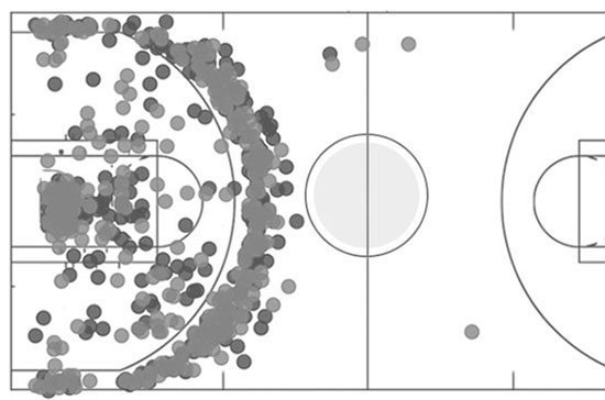
Two of Thomas’ major passions are basketball and data. He took the opportunity to combine the two in order to better understand “why Steph Curry is such a dangerous player on court.” Thomas not only likes the flexibility of Power BI but said that it helped him to create this NBA shot chart with relative ease.
With this project, Pawlowski wanted to highlight how a basic report could be transformed using design, layout and visualization. He said, “As Power BI provided interactivity between visualizations, I was able to use a simpler layout without losing the broad appeal of drilling into each country one at a time.”

Winter created this dashboard because much of his office was playing “Pokémon Go” and they wanted to learn what others were saying about it on Twitter. He explained, “I was able to be innovative and efficient when developing this dashboard because of Power BI’s custom visuals and the ease of sharing it with my colleagues.”
We may not be there yet, but visualization continues to make strides into the mainstream. Interactive graphics are front and center in Rio Olympics and 2016 presidential campaign coverage. These stories don’t supplement written copy; the writing gives context to the visual centerpiece.
That intern at The New York Times, Josh Katz, he’s now a graphics editor for The Upshot, The Times’ data-driven section focused on “news, analysis and graphics about politics, policy and everyday life.” The managing editor for The Upshot is Amanda Cox, who was part of the The Times’ graphics desk for more than a decade. And, Steve Duenes, the former graphics editor, is now the Times’ Associate Managing Editor in the newsroom.
“Journalism is more than just a profession: it’s a mindset and approach to critical thinking. The ideal journalist, spots facts, gathers them, double-checks, filters, shapes and then communicates in the best form for that type of story.”
“We’re seeing these stories move into a more central role,” said Cairo. “A visualization may have been the biggest story of 2013, but this is the year that data journalists in newsrooms big and small started to bring home Pulitzers.”
Alberto Cairo worked with Microsoft to develop five guided learning courses on visualization methodology for effective data storytelling. The courses include an introduction to visualization, an overview on data exploration, detail on truthful visualization, tips for choosing the right graphics and insights on design and narrative. These short classes feature interactive Power BI demos, so viewers can follow along and learn in real-time. See the courses.