

In an era rife with hacked campaigns, bots and election interference, one news organization has returned to an age-old maxim: Every vote truly does count. And they’re using data to prove it to readers.
Politico Europe, a joint venture between the American media organization Politico and German publisher Axel Springer, unveiled an election-coverage hub ahead of the 2019 European parliamentary votes held in May. It gives citizens a deeper look at the democratic process and allows them to connect their top issues with candidates in the field.
Now called Poll of Polls, the platform offers interactive data visualizations built with Microsoft Power BI. It also provides political news stories and analyses of votes cast during elections within each of the 28 member states of the European Union.
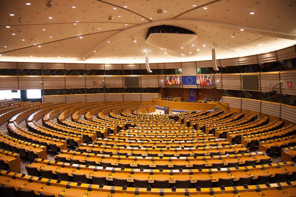
The European Parliament building. (Getty Images)
Launched in collaboration with Microsoft, the site aims to show readers how their individual votes can affect political outcomes on a continental level.
“To illustrate that, we have charts showing how many votes it would take to switch an MEP (Member of European Parliament),” says Etienne Bauvir, director of business intelligence and technology at Politico Europe.
“In countries where turnout is notoriously low, like some Eastern European countries, it didn’t take many votes in May to shift an MEP and to have her lose a seat or win a seat. That’s one thing we wanted to make evident to readers – the impact of one vote can be big in some countries,” he says.
Case in point: Romania, where the Social Democrats earned 22.5% of the vote – causing the party to lose six parliament seats – while Renew Europe collected 22.4% of the vote – causing that party to gain seven seats. European parliamentary elections are held every five years.
Politico Europe’s new hub provides one page for each country, enabling readers to drill further into more precise 2019 election results, such as how pro-European Union candidates fared in France against skeptics of the EU. (Pro-EU MEPs in France currently outnumber EU skeptics 48 to 28.)
Poll of Polls also tracks fresh polling data in each country, offering projections of 2020 votes in individual nations. That helps readers better understand some of the complexities of European politics, including the power of ideological groups.

Etienne Bauvir.
“In the projections, we can be reactive and proactive in our data analyses,” Bauvir says. “In the European election process, many national parties come together to form groups in the European Parliament. It’s often not clear which party will form which group. We can offer an accurate picture of that reality.”
Think U.S. elections are confusing? Elections to the European Parliament can span thousands of candidates representing hundreds of parties across 28 nations.
With Power BI, visitors to the Politico hub can use interactive features to maneuver polling or election data in ways that help them digest election night results or votes yet to come – both in national parliaments and for the entire European Parliament.
For example, one Politico visualization shows a graph of polling data in the United Kingdom, where citizens will elect their new parliament Dec. 12. By moving a cursor left and right, readers can view how the Conservative, Labour and Liberal Democrat parties have performed in polling each day from late 2018 to present.

Hanna Pawelec.
“In the spring, we also had visualizations showing forecasts of how the future European Parliament will look. We could update those visualizations just by changing one data file,” says Hanna Pawelec, a Politico Europe data analyst. “By quickly updating those visualizations, we were one of the first newsrooms to show more in-depth analysis.”
“Power BI is easy enough for a citizen journalist to create a simple interactive with little training, but powerful enough for a seasoned data scientist to do complex analysis across multiple datasets,” says Ben Rudolph, senior director of Microsoft News Labs. “It’s the definition of democratized technology.”
Microsoft News Labs represents the company’s global effort to help journalists and journalism succeed by augmenting human creativity with innovative AI and content-creation technology.
Rudolph’s team began collaborating with Politico Europe after learning that the news organization wanted its audience to understand how the vote in one country could re-shape the entire European political landscape.
The two groups met in Brussels, Belgium (where Politico Europe is based) to discuss solutions that would help readers and viewers better engage with the news organization’s election coverage.
“The challenge wasn’t just wrangling the complexity of 242 parties competing for 705 seats in the European Parliament, but creating an experience that was at once compelling and transparent,” says Vera Chan, Microsoft senior manager for worldwide journalist relations.
Readers flocked to the news site. During the final stages of the European elections in May, Politico Europe’s traffic hit an all-time high with a nearly 30% increase compared to traffic measured one year earlier.
“This election,” Bauvir says, “was the moment to really widen our readership to the average citizen throughout Europe. We’ve now succeeded in retaining much of the additional audience we engaged. That’s another big success due in part to this hub and those visualizations.”

The Politico Europe newsroom in Brussels.
In the months since the election, traffic to Politico Europe remains on average 24% higher compared to the same period in 2018.
Politico Europe is now examining ways to expand the platform, focusing again on Europe, says Natasha Bernard, communications coordinator at Politico Europe.
“Data journalism with Power BI can play a unique role building audience trust,” Rudolph says. “Not only does an interactive visual give readers deep insight into a story, it also gives them unprecedented access to the data behind that insight.
“It’s a completely transparent means of storytelling,” he adds. “We think this will be increasingly important for outlets of all sizes as we approach the 2020 election cycle.”
Images courtesy of Politico Europe.