Data visualization training for journalists
Why Power BI in journalism?
Now more than ever, data is becoming readily available for anyone to access. With Power BI, learn to create visually appealing stories that engage readers through interactivity and deep data insights. Connect to data through hundreds of connectors and bring it all together for your audience to explore for themselves.
What you’ll learn:
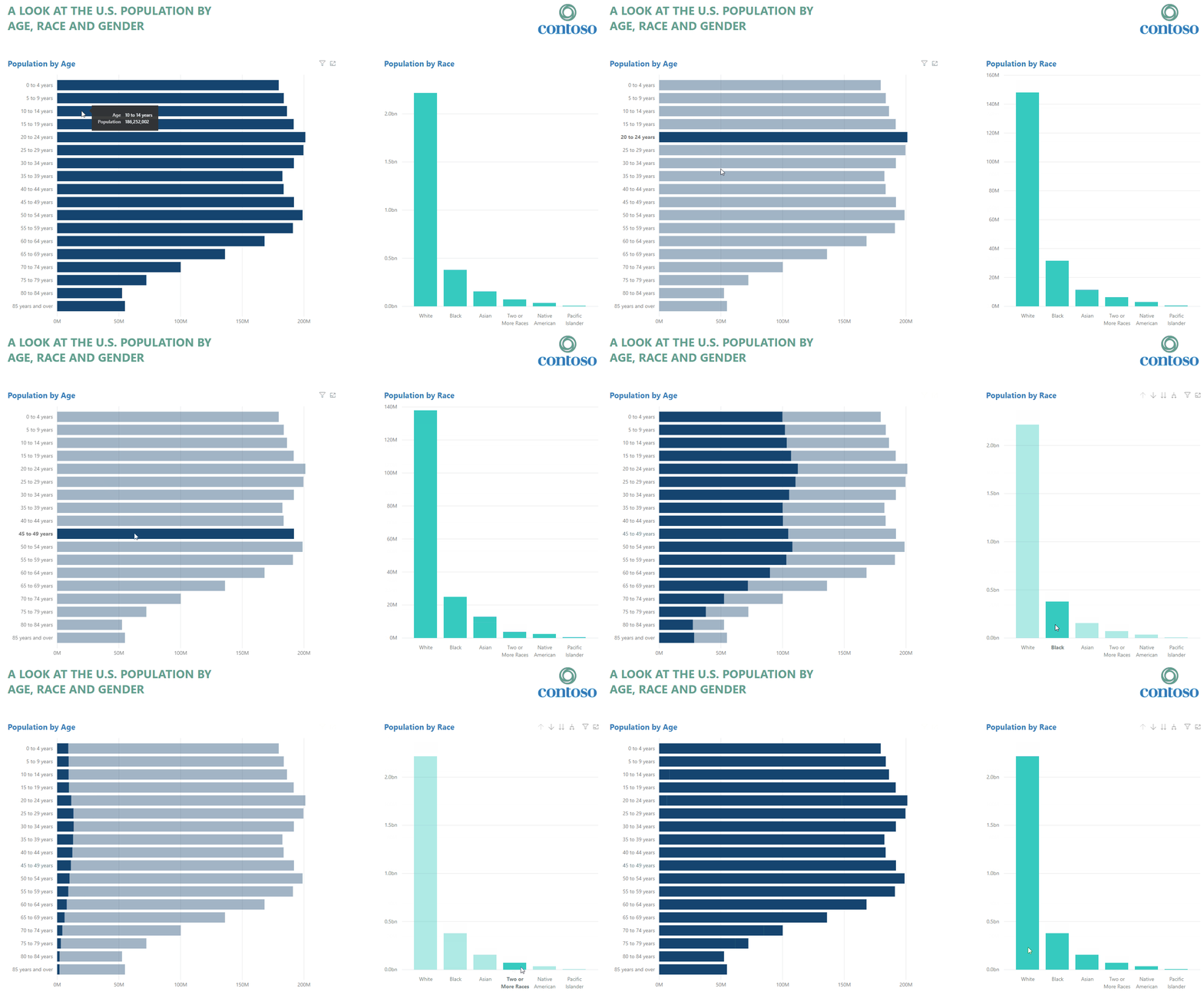
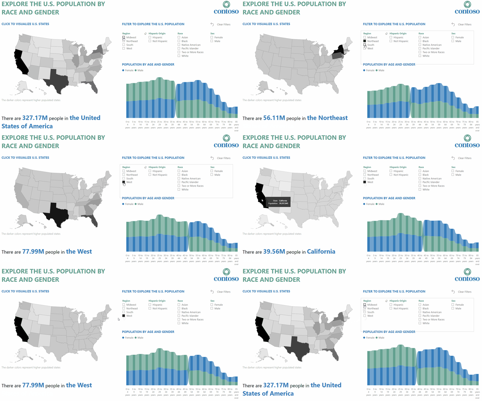
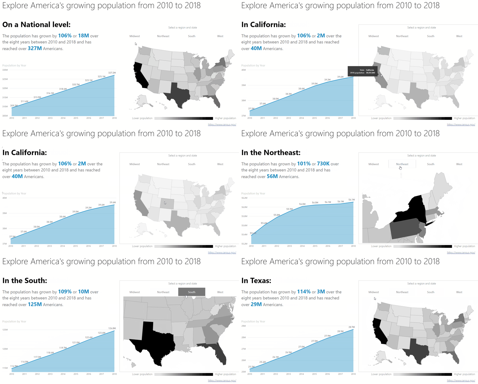
In these modules we demonstrate just how easy it can be to transform a bad dataset into a clean and modelled dataset that is both easy to use and understand. Power BI makes it easy with the Power Query editor. You will learn how to create and remove columns, replace unwanted values and also join many data sets together to form a clean data model. We then move into how to visualize data and make it interactive to keep your readers engaged and informed. There are extra modules which explain Power BI Service and how to publish the reports you create. Download the training resources below to find out how!


For extra inspiration, go to the Data Stories Gallery where you will find hundreds of beautiful report examples built by the community. Upload your own data vizzes in the “News” category to share and inspire, as well as get feedback from an impassioned audience.
Click here to download the full set of modules!


