Visualizing data with Power BI
Why Power BI in journalism?
Now more than ever, data is becoming readily available for anyone to access. With Power BI, learn to create visually appealing stories that engage readers through interactivity and deep data insights. Connect to data through hundreds of connectors and bring it all together for your audience to explore for themselves.
What you’ll learn
Provided below are three short exercises where we demonstrate how easy it can be to pull in data from online sources, model it slightly to suit your needs and then present the data in a visually appealing and effective way. You will learn how to import data from your file system after downloading from the web, what steps to take when preparing your data and then finally give you examples in how to present data that is easily understandable and interactive.
Use these visualizations
The training material includes the complete Power BI visualizations that you can download and then publish to your site. Follow the accompany instructions to see how you can adapt, redesign or revamp reports to suit you. Play around with different colors, visuals, layout, add in more data and then publish these reports to a workspace of your choice in Power BI Service and share with your teammates.
Note: You’ll need to update the path of the source files to match the path to where you’ve saved the training material. Instructions on how to do so are included at the end of each workbook.

Module 1: Election Voter Turnout
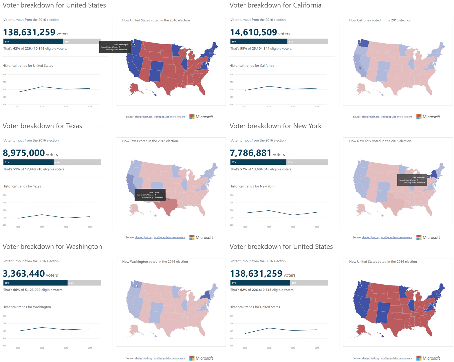
This report covers Voter Turnout results per state in the 2016 presidential election, with some historical data for support. It provides some fun interactivity with the map to keep the user engaged and curious about what the data may look like for other states.
Data sources: electproject.org and worldpopulationreview.com

Module 2: Candidate Contributions
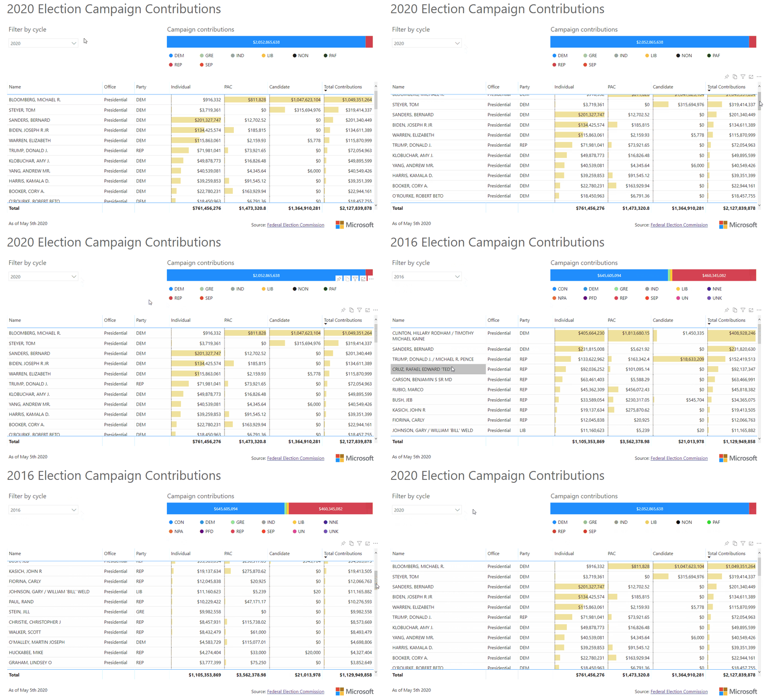
The second exercise covers the Candidates’ campaign contributions in the current and previous presidential election races. We show an interesting way to compare how each candidate stacks up against each other in the race to become president of the United States. This also has historical data for some user interaction.
Data sources: Federal Elections Commission

Module 3: Covid-19
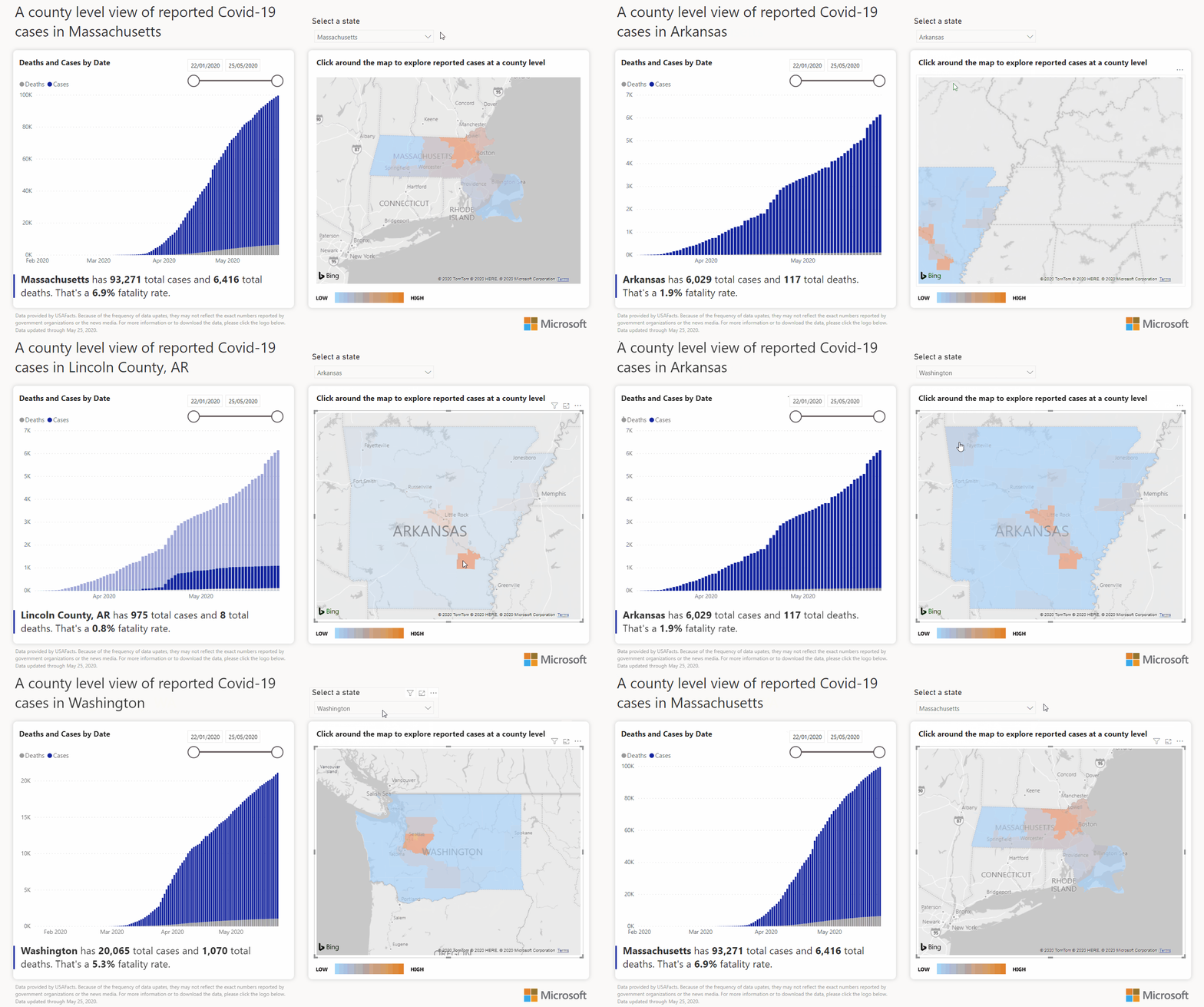
This module covers how to use an existing data model to create a beautiful, engaging report that utilizes the interactivity of a map along with supporting visuals to show data effectively. You will download an existing report that Microsoft has created and expand upon that by creating a brand new page that you can publish for your own use.
The latest version of Power BI Desktop is required for these resources, you can download Power BI Desktop here or from the Windows Store.
For more inspiration, go to the Data Stories Gallery to find hundreds of great examples built by the community. Journalists can upload their own data visualizations in the “News” category to share with an impassioned data audience.


