

Bringing data to life: KING 5 TV journalists use visualization tools to pioneer new era in reporting
Puget Sound voters were the first in the nation to get a real-time, in-depth look at their local civic process, as Seattle broadcaster KING 5 harnessed new technology to bring data visualization to TV and computer screens, heralding a new era for political reporting on a local level.
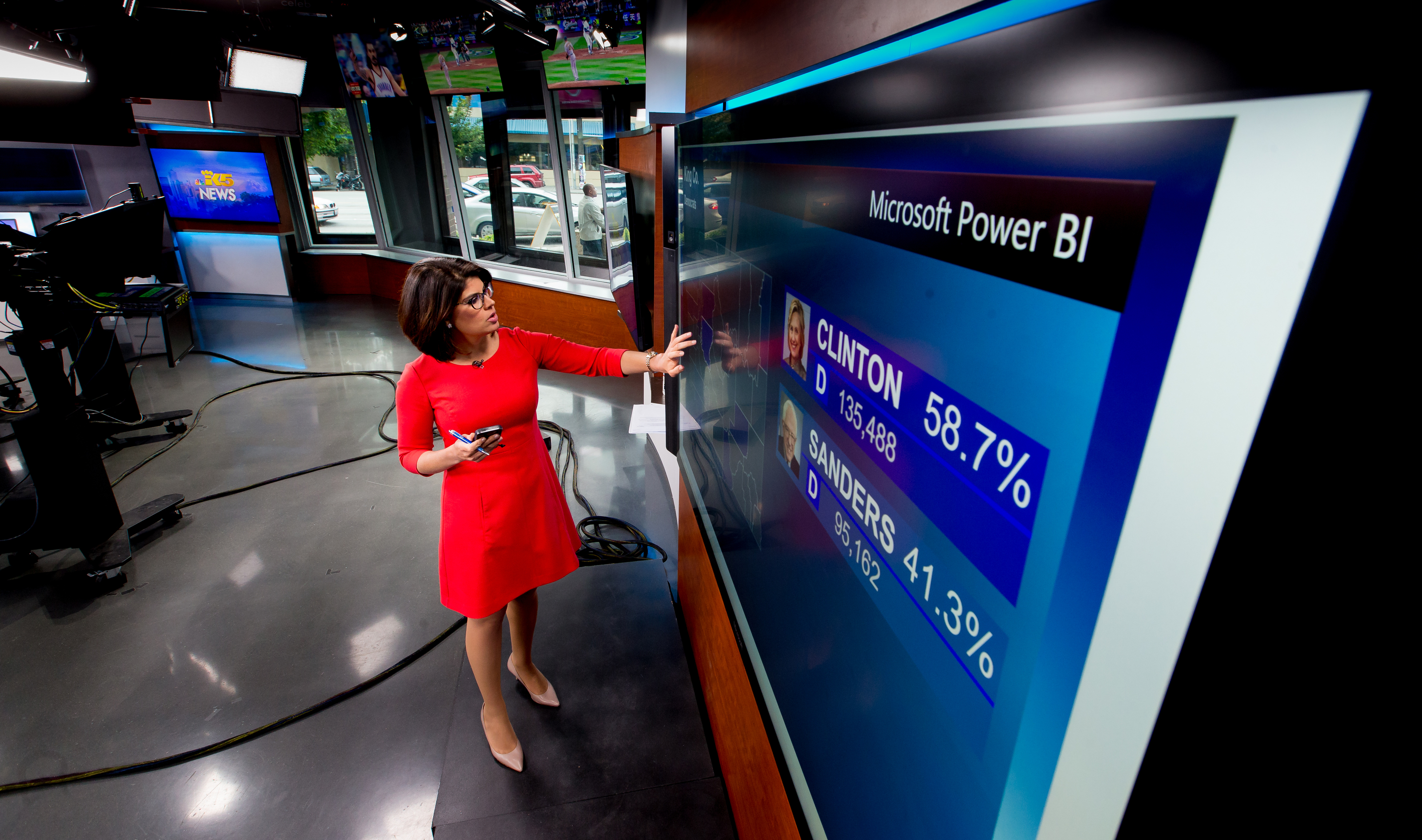
The station was able to drill down into the results of Washington state’s May 24 presidential primary and share insights county by county, as votes were tallied, by using Microsoft’s Power BI data visualization tool, displayed to viewers on a large Surface Hub touch screen as well as through an interactive report online. The new capability is a prime example of gains made in the accessibility of data and the technology to analyze and share it.
“This is something I’ve wanted to do for a long time, but it’s never been possible before at the local level, only for the networks, who’ve spent gobs of money on custom software packages that are well beyond local TV capabilities,” says Peter O’Connell, executive producer for special projects at KING 5. He’s been covering elections since 1976, when there were no electronic graphics and TV stations just put numbers on boards and filmed them.
Today’s technology “has the ‘cool’ factor, yes, but it’s the information that I care about – giving viewers a much better picture of what’s going on in an election and letting them see for themselves, in real-time, the same county returns that we’ve always had internally,” O’Connell says.
KING 5’s broadcast was “a total game-changer,” says Marco Lowe, a campaign and elections professor at Seattle University who appears as an expert on the TV station’s political segments.
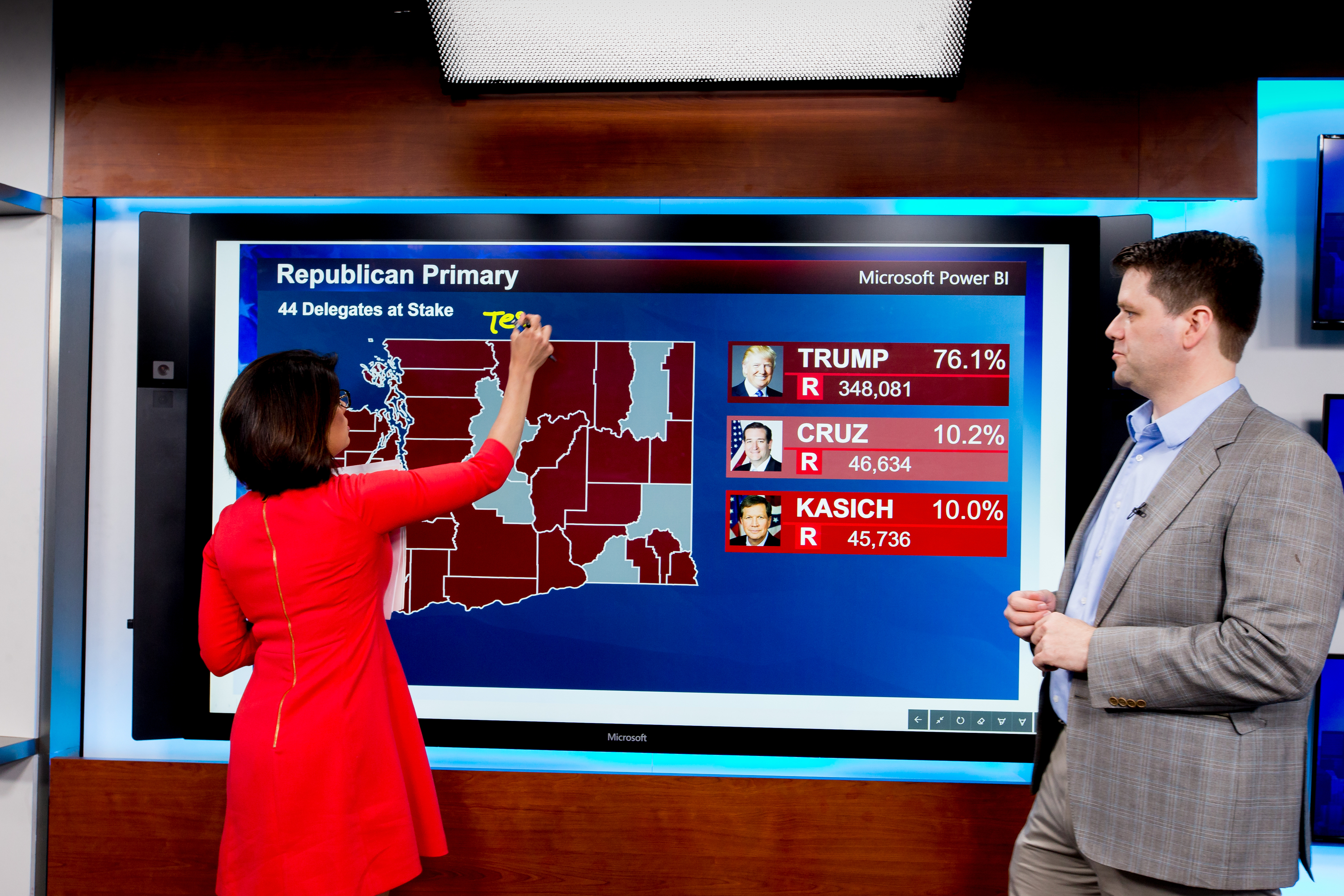
Lowe and reporter Natalie Brand went on-air throughout the evening, touching back and forth on the Surface Hub between the state map and individual counties to tell the story through data streaming into the Power BI report as the 39 counties posted results. Even the state-wide map showed a more detailed view than would have otherwise been possible, filling in the county borders with shades of blue for the Democratic candidates and red tones for the Republicans, depending on which presidential hopeful was winning.
“The visualization of data is an essential and necessary tool to explain these complex and fluid campaigns,” says Lowe. “The human eye is attracted to color and movement, so if you’re able to provide data that way, viewers will be able to take in the information at a much faster rate, and you’re providing them with a more compelling story. Standing there with that map filling in the counties as we talked was a very different experience, and now I just don’t even know how you’d tell the story without it.”
Data is as important as pictures in helping people interpret a story, and especially in an election, where voting patterns give us insights into how we as a society are thinking about the road ahead, says Kamal Hathi, director of program management for Microsoft Power BI.
“Decision-making used to be made with your gut, but now it’s driven by data,” he says, “and visually understanding what the data is telling you helps by showing you the highlights and patterns, so you can make decisions that are analytical in nature as opposed to qualitative.”
There have been huge strides made in the past five years as journalists – and therefore the public –benefit from the growing availability of accessible, affordable, easy-to-use tools to showcase the increasing amount of data from government agencies and other sources, according to Mark Horvit, executive director of the Investigative Reporters & Editors (IRE) organization. When Horvit first learned how to use data as a reporter in the mid-‘90s, through IRE’s National Institute for Computer-Assisted Reporting, he says he didn’t have the ability to do any visualizations at all.
“There were people on staff who could work with the information and do them, but it took time and expertise,” he recalls. “There’s still plenty of high-end stuff being done that way, but now there are tools that let you make maps and charts, and that are interactive, and you can take budget info, or crime info, or financial info and present it to your audience in a way that lets them understand and interact with it, and that can be done on the fly and for daily stories.”
And that computing power is available to anyone, through off-the-shelf technology, meaning “any Power BI user in the world can do exactly what these guys are doing,” says Lukasz Pawlowski, a senior program manager for Power BI who was the lead engineer to help KING 5 get set up.
The real-time capabilities were key in providing viewers information they couldn’t get anywhere else until much later, Brand says.
During one broadcast hit, Brand and Lowe were waiting for results from one last county. “There it is!” O’Connell exclaimed into Brand’s earpiece from the control booth while watching the screen update behind her in the studio, filling in the final greyed-out county. “Good stuff. I just love it when everything rattles in.”
Without the new technology, KING 5 would have had to simply describe voting patterns to viewers that evening, lacking the supporting visuals, O’Connell says. The design department would have had to wait until the figures were in to create a map that would have been outdated with each new tally.

“It’s industrial-strength technology with real-time information being applied to the news cycle,” says Power BI’s Hathi. “You wouldn’t drive your car looking in the rearview mirror all the time. The same is true of data. Most tools focus on historical data, but we enable you to drive your organization looking ahead, instead of in the rearview mirror.”
At one point on election night, thanks to the streaming data and the speed with which the software was able to analyze it, O’Connell realized KING 5 was the only news organization in the country to have been able to report how many delegates would be assigned to the Republican front-runner from Washington. No one else had that material for another 20 minutes – “an eternity in TV.”
Viewers got the biggest benefit by being able to dive into the data themselves, Brand says, as the reports were shared online with the same live data through Power BI’s Publish to Web service, with design features formatted to fit the smaller screens of tablets and mobile devices.
“Traffic to the site was great, and it got viewers excited,” Brand says. “It empowers them, and that’s where I hope we can start providing even more information and even greater insights after this first baby step. It added hugely to our coverage, but it was basic. There’s a lot more room for creativity as we overlay more data and try to find trends.”
O’Connell and Brand are already dreaming up new story ideas for analyses that can be done on state races later this year, and more. Brand says she’d like to compare counties’ economic data with their voting results, for example. The possibilities are endless, she says.
“The ability to evaluate large data bases and then turn them into visuals has great potential, and we haven’t tapped it really yet,” O’Connell says. “What we did in the election is a known thing, it’s data we’ve always had access to, but we were able to process it and display it better. The real opportunities are to take data sets we normally don’t have or haven’t been able to evaluate, and come up with stories we haven’t had before.”
O’Connell is also using Power BI reports internally to track his station’s all-important ratings.
“Data is the heart of everything,” Hathi says. “It’s a data culture now – understanding data, interpreting it, making decisions based on it – that’s rising to the same level of ubiquity now as basic literacy.”
Photos: Scott Eklund/Red Box Pictures


